Showing posts with label faces. Show all posts

Saturday, February 4, 2012

29 Faces : Gallery

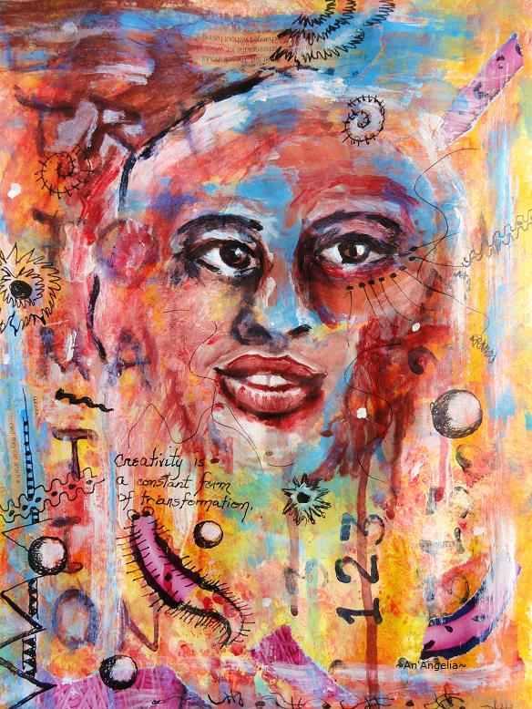
I was visiting my new journaling friend, Stephanie, over at her blog, Dragonfly Design Studios, and was delighted to learn of a February 29 Faces Challenge -  Create 1 face per day for the month of February.  Well, how could I miss that party?  I've been just a little obsessed with faces lately, so I went over to the host site, Ayala Art, and joined the party.  If you're interested, hop on over - there's plenty of room for you and still time to catch up!


Well, the 29 Faces Challenge has ended with the arrival of March.  There are new artistic endeavors to pursue and I'm sure other challenges await.  Thanks, Ayala, for hosting this really fun, February challenge!


DAY 27
Acrylic


DAY 26
Acrylic and water soluble charcoal pencils


DAY 25
Acrylic


DAY 24
Pastel pencils in journal
Add 


DAY 23
India ink, quill pen and watercolor wash in journal


DAY 22
Acrylic paint applied with letter "m" stamp in journal


DAY 21
Acrylic paint applied with scrap cardboard in journal


DAY 20

Collage and acrylic in journal


Here I am!  Can you say "burned OUT"?  I've been doing my faces daily, but I just could not for the life of me, make a post.  I couldn't even get myself to do the photographs!  I'm feeling a bit more enthusiastic again,  so hopefully I'll be posting regularly this week.  I can't wait to see what all of you have been doing.  Thank you for all the kind comments - I've got some catching up to do!


DAY 19

Charcoal and yellow ochre acrylic in journal


DAY 18

Mixed media in journal (collage/acrylic)


DAY 17
Acrylic in journal


DAY 16

The other half of Day 15 journal spread


DAY 15


Mixed media in journal.  To see the process, go HERE


DAY 14

Mixed media in journal.  To read more about it, go HERE


DAY 13
Mixed Media in my journal


Read more about face number 13 HERE


DAY 12 

Acrylic


DAY 11

Watercolor and Prismacolor pencils

DAY 10

Acrylic


DAY 9

Acrylic


DAY 8

Acrylic


DAY 7


I created this face on a journal page that had blue and pink acrylic paint smeared on it from a previous project.  I began filling in the white areas of the page with torn magazine images.  I thought I was headed in the direction of Matisse by doing paper cut outs, but my muse just wasn't having it!  So, out came the gesso and I roughed in an area for a face.  I began sketching with a charcoal pencil blending it into the gesso.  She's a tad creepy to me, but I was listening to (a really AWFUL) new age instrumental online.  I really thought I was on the path to "fun and cheerful", but somehow entered the twilight zone! LOL


DAY 6

I created both faces yesterday using background pages that I created in my Saturday art journaling class.  I taught this background technique using multiple layers of collage, acrylic washes, and gesso.  My background became predominantly ochre, sienna, and black and had an aged feel.  That was the inspiration for my faces.  The African inspired page includes potato printed paper that I made last year. ( I was surprised that I remembered I had it!)  The Native American inspired page includes words and imagery such as old coins and buffalo.


DAY 5


The First Four Faces

I found out about the party yesterday, so I had some major catching up to do.  I completed the first 3 faces yesterday, and just finished the 4th face just a little while ago. 

DAY 1


This is an intuitive painting.  I tore wrapping paper into pieces and Mod Podged it onto the page for my background.  I could see the shape of the face and shoulders in the torn paper and brought the features out with acrylic paint.

DAY 2


This was another intuitive painting.  I created multiple layers with torn paper, acrylic ink and acrylic washes.  Sooner or later, I always seem to find a face.  He was no exception!

DAY 3


This is an homage to Modigliani.  His portraits of women, with their unpainted eyes and elongated, sensuous necks intrigued me as a junior high school artist.

DAY 4


Another intuitive painting, this seafarer emerged among the layers of torn paper and paint.  Something about him reminded me of VanGogh's work, so I decided to emulate his impressionist style.  

I can't wait to see where day 5 takes me!  I'll be adding all of the faces to this post, so you'll be able to see my family of 29 as they emerge.

I hope you're having a wonderful weekend, and I'll see you again on Monday with mandala number 16.  Weekend Journal will be back next week - we've got some catching up to do!

CELEBRATE * LOVE * CREATE

Friday, March 18, 2011

Playing with Water Soluble Pastels

Here are pages from my journal that I did last week.  I hadn't played with my water soluble pastels for awhile so I took them out one evening.  I didn't want to turn on any lights, so I decided to sketch by the light of the television as Keith and I tortured ourselves with the Food Network.


I used an ochre yellow pastel and began sketching.  I began with a fluid line and before I knew it, I was sketching faces.  The next day, I softly blended the features and I liked the ghostly appearance that resulted.  I darkened some of the features and added hair with a black pastel and did more blending.  I added blue to the shadow areas and more faces with the same blue, softening each layer.  


I continued playing with my pastels and another face emerged.  I recently discovered that I can print right to left writing each letter backwards as easily as printing normally.  Who knew!  I had no idea I could do this and it was a fluke discovery.  I incorporated printing in this style on this journal spread and I think it adds to the overall feeling of mystique created by the chiaroscuro.


Speaking of faces, my colored pencil drawing is coming along nicely.  I'm really enjoying my very laid back class.  My classmates are awesome and we're rapidly becoming friends.  I've learned a lot about colored pencil - mostly that it's nothing to be hurried!


I'm not finished with her face, but the self proclaimed "queen of color" had to get away from the skin tones for awhile and add some color!  The leaves are a pain (it crossed my mind to put a head wrap on her!), but I decided to stay true to the original image.  I only work on her during class.  The lighting there is fabulous!


I've also been using colored pencil more in my journal.  This detailed spread is collage (The sun/moon mirror, the tree and the head, torn from an old Design Tuscano catalog), Pilot VBall pen, and Prismacolor pencils.  I worked on it mostly in the evenings.  It was inspired by my prompt for March 10th: "I don't want to", and the song by Gavin Degraw, "I don't want to be".  The writing is lyrics from that song.


I hope you're having fun in your journal.  I hope you're experimenting and breaking through "blocks" that you may have.  Most of all, I hope you're finding time each day to "Celebrate, LOVE, and Create!"

Monday, February 14, 2011

Drawing II

So I had my 2nd drawing class last Wednesday, and I have to say it's starting to grow on me.  I decided that I would only work on my drawing in class, but in the meantime, I started playing with a new drawing at home. 

The first week, I applied lemon yellow, peach and blush pink layers (Prismacolors).  This week, I began shading her face with sienna brown.  This is referred to as "mottling" the face.  The next layer of color will be pink.  Then mineral orange, cherry black or black raspberry.  I also added her 2nd eye.  She's alive! (at least a little bit).


I wanted to apply what I'm learning to another drawing, so I found another picture in my picture file (torn from a magazine).  Her skin is a lot lighter, so there aren't that many layers of color.  I began with yellow and used peach and sienna.  The shadowed area is olive green and indigo blue.  I made the mistake of using black, but the color was "dead".  (I should have known better.) My fax pas was easily corrected with a kneaded eraser. 


It's still very textured, but when I finish applying all of the color there will be a final burnishing layer of what is now a mystery color.
Over the weekend, I watched the movie, "Coco before Chanel".  It's a french, subtitled movie staring Audrey Tautou as Coco that I have on DVR.  The cinematography is beautiful, and I was so inspired by some of the close ups of Audrey's face that I did some charcoal sketches with the help of the "pause" button.

I had applied a glaze of aquamarine blue to my next set of journal pages.  (I always put left over paint in my journal pages.  I really can't stand wasting paint!)  I started sketching some of the stills with charcoal and added a wash of sienna brown when I finished sketching.


I really loved the way the right side of the page turned out.  I added some white artist acrylic to cover some of the blue and added a phrase in French.  Although I don't speak French, it seemed fitting for the page.  Gotta love Google Translator!


I'm enjoying drawing again.  It's been years since I've really drawn anything, and after looking at all of my wild, fauvism styled art, people seemed shocked that I even know how to draw.  That makes me smile in amusement every time.

Whatever your endeavors, remember to explore different creative styles and mediums, and as always, "Celebrate, LOVE, and Create!"

Saturday, May 8, 2010

Junk to Journal: "Look Into the Southern Sky"

I really liked this accordion fold booklet that I received from Cleveland MOMA several years ago.  It's an invitation to a gallery show filled with extensive information about the show/artists.  (Yes - I'm a closet hoarder but I don't need an intervention just yet.  Well, maybe....)  I knew that one day I would use this invitation in my own artwork, and as it turns out, it was perfect for a "junk to journal" project.


When I began, the only thing I knew for certain was that I wanted to maintain some of the color on each page, and I also wanted to make sure that some of the words were still visible.  Other than that, I had no idea in what direction I was headed.  I loved the black/gray striped cover, and that gave me the idea to look through my portfolio of magazine pages.  I'm wild for color, but I'm also drawn to black & white (b/w)imagery so I had quite a few predominantly b/w images in my collection.  One such photo was that of a male.  It was a very moody photograph with very little contrast. The predominant feature was the large, black sunglasses.  I used that for the cover and decided to pull some of the red-orange color from one of the other pages.   I decided to paint over the features and also altered the hairline turning "him" into "her".   I came across the words "Look into the southern sky" and they just seemed to fit with the sunglasses and the feel of  the warm, sunny background.
Click on any image to enlarge
The next images that I came across were the skeleton heads.  There were actually 4 or 5 of them in one strip, but I tore them out individually.  I then came across the dog, the watch face, and the turquoise stone.   The stone reminded me of an art mannequin head right away.  I began playing with the images and it occurred to me that they looked like some kind of bizarre evolutionary timeline.  That's when the journal took on a "life of it's own".  It's a story of where we are now as a civilization and where, maybe, we're headed.  I hope you enjoy viewing the images.

Other notes of interest
I used this booklet upside down. The writing shows through the paint in places, but the font is small and can't easily be read upside down so it's not distracting.  I used tempera and acrylic paints and Mod Podge as an adhesive.  I also used a Sharpie extra fine black marker and a white gel pen.  No humans were harmed in the making of this art.
Related Posts with Thumbnails